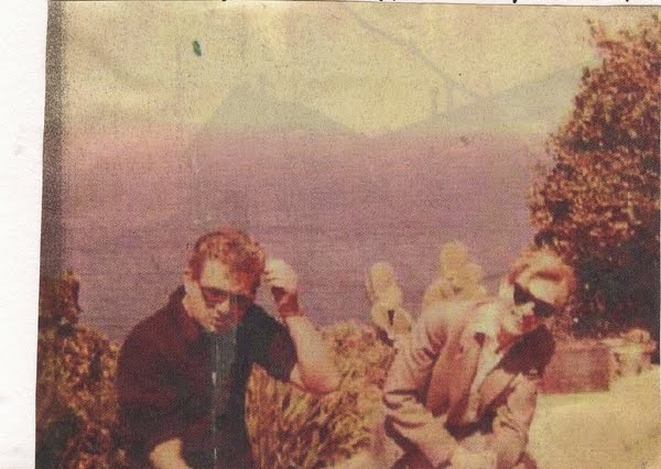
Observer Colour Magazine spread from July 17th 1966, Escape from Silence. Photograph: Jane Bown
It's all about the face. Always the face. A glance at the cover of the first issue of the Observer Magazine tells you in an instant how much – and how little – magazine journalism has changed in Britain over the past five decades. The "tasters" seem clunky and oddly downbeat – "Mountbatten Speaks on World War 2; In Colour: Verdict on the Paris Fashions" – but the portrait, with its clever crop, could have appeared on any magazine this morning. This was 1964. Newspaper publishers were waking up to lucrative possibilities: postwar gloom had lifted, shiny new products were on the shelves; cars, televisions and holidays were within the reach of ordinary people. There was a rich seam of advertising to be exploited – but to have impact it had to be in colour.
The Sunday Times had taken the lead with a magazine in 1962. This, and the launch of the Sunday Telegraph a year earlier (though without a magazine) made the Observer sit up and take notice. It had to fire back to survive. That it took two years for the first Observer Magazine to appear says much about the debate that went on in the paper's cramped and tatty offices in Tudor Street, just off Fleet Street.
It required a style of journalism alien to intellectual editor David Astor. He had made no attempt to hide his fear that a colour magazine would cheapen the quality of his paper. In a brochure sent to advertisers in 1958, he announced resolutely: "It is our firm intention to remain a compact newspaper, and to resist the temptation to become a Sunday magazine. We shall not lower our standards in the search for circulation." But by 1963, economic imperatives had forced him to change his tune. "Since the Sunday Times pioneered colour, readers and advertisers have come to want and expect it, and we know that many of them would like to see the Observer enter that field," he announced.
The Sunday Times Colour Section (later the Sunday Times Magazine) was influenced by the style of glossy consumer magazines such as Town and Queen, and the colour photojournalism seen in overseas titles Paris Match and Life. If the Observer was to have a colour supplement it would have to totally rethink the way it commissioned and displayed photography. In 1963, a year before the launch of the magazine, the paper was made up of 40 pages, cost 6d and came in two parts – a news, comment and sport section and the Weekend Review. Pictures were used to break up the text, some purely as "stand-alone" images. The issue of 22 September that year, for example, carried just 29 photographs. These came from several sources – freelance photographers, news agency pictures and the paper's own picture library. Photographers were actively encouraged to add to the library. These results became part of a unique narrative of photojournalism. Depictions of both the ordinary and the sensational were carefully filed away into a series of envelopes in case they should be needed.
When it was finally agreed to launch an Observer magazine, Astor appointed assistant editor Michael Davie as its first editor. He set about producing a "dummy" to circulate to potential advertisers. Photographer and picture editor Bryn Campbell, brought in for the vital planning stages, introduced new photojournalists to work alongside existing regulars.
Divided into four sections – "Leisure", "The Arts", "Our Changing Society" and "The World at Large" – the dummy featured photographs by Campbell as well as Jane Bown, Gerry Cranham and Robert Freeman. Astor wrote the introduction and showcased some of the journalists who'd contribute to the finished version. Among these were Anthony Sampson, Mary Holland, Shirley Conran and the cricketer Ted Dexter.
Davie flew to New York, where he persuaded the executive editor of Life magazine, Paul Mandel, a man with an eye for a good picture story, to relocate to London and help him with the first issues. Aided by Campbell's connection to a talented group of British photographers including Ian Berry, Terence Donovan and Don McCullin, he helped provide a fresh visual identity for the magazine.
The first issue, "not to be sold separately", contained prominent pictures by John Hedgecoe (including the Mountbatten portrait), Loomis Dean, and a photo story on the London stock exchange by Gerry Cranham. Of its 64 pages, 30 appeared in full colour. About half of the magazine was devoted to advertisements for dishwashers, cars, sofa-beds, anti-wrinkle creams, stereos, whisky, central heating, Bri-Nylon carpets, washing machines, Pan Am Airways, and several brands of cigarettes. They help tell the story of the era and indicate the type of aspirational audience the magazine was hoping to reach out to every Sunday.
To be a photographer for the magazine was to have your work enjoyed throughout the week and often longer. At a time when most art galleries did not show photographs, the magazine played a pivotal role. Campbell had a particular philosophy. "All of them knew they were allowed to fail, and I think that's one of the most important things you can do as a picture editor."
Within a few years of its launch the magazine was so successful the rest of the paper became financially dependent on it. Astor, who had initially been so resistant to the project, was vindicated in driving the Observer into a new era, and pushing up circulation in the process.
Robin Christian and Stephen Pritchard
This text was originally published in the Observer Magazine, 31 July 2011


